Elin Wyn
Personal Training
A complete brand identity built as a total system — from logo to photographic language — for a luxury personal trainer in Pontcanna, Cardiff.
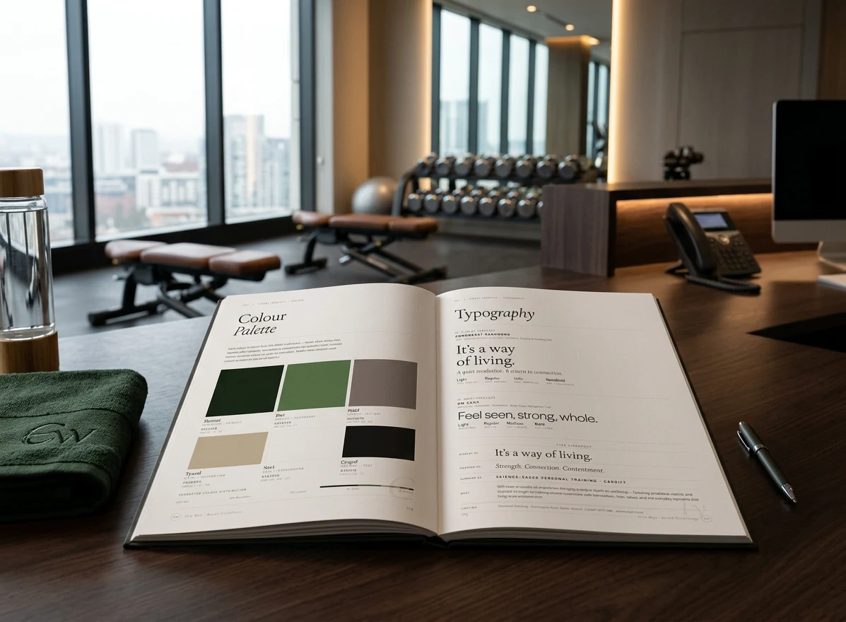
Elin Wyn is a personal trainer for a very specific kind of client: high-achieving, aesthetically literate women in Cardiff's most affluent neighbourhood who want results, but will not trade their taste for them.
The previous brand was indistinguishable from a hundred other personal trainers. The new brief was to make Elin Wyn feel like a private studio — a brand that her clients would be quietly proud to mention, in the same breath as their other considered choices.
The positioning: not a fitness brand. A refinement brand.
The brand was built around a single governing idea: refinement, not fitness. Every decision — colour, type, photography language, tone of voice — was made to position Elin Wyn as the considered choice in a market full of louder, less precise alternatives.
The identity began with the logo: a mark of quiet authority, designed to work on a business card and on a gym wall without losing anything in either context. The typographic palette balanced an editorial serif — carrying authority and a sense of considered intelligence — with a restrained geometric sans for body copy and functional communications. The colour system used warm, muted neutrals rather than the high-contrast palette ubiquitous in the fitness category. The choice was deliberate: this is a brand for an audience who finds understatement more reassuring than energy.
Photography direction was central to the brief. Elin Wyn's clients are aesthetically literate — they notice when something is right and notice equally when it isn't. The photographic language had to be worthy of their visual standard: natural light, considered composition, a complete absence of the performative aesthetic common to the wellness category. Geoffrey art directed the shoot brief and applied colour grading across the resulting image library to ensure every photograph read as part of a consistent, curated whole.
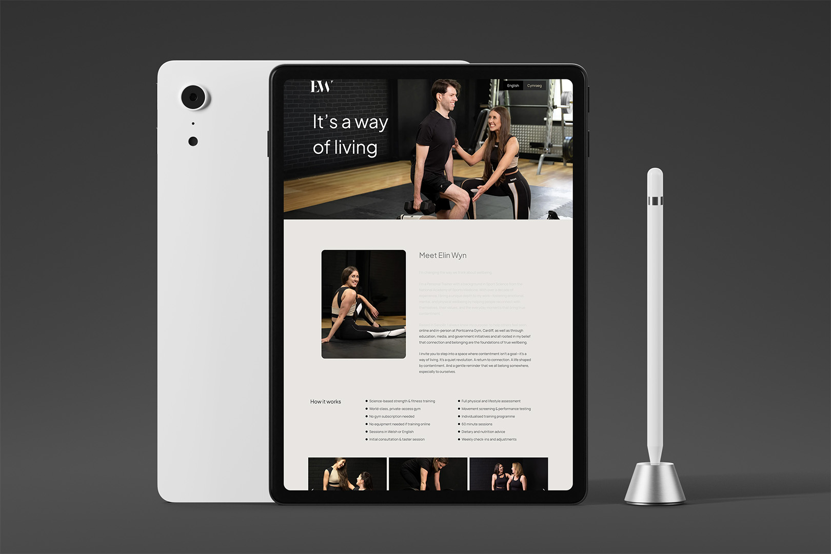
The website translated the system to digital scale — carrying the typographic rigour and photography direction into a layout built for the specific behaviour of Elin Wyn's audience: high-intent, primarily mobile, visually discerning women who make their decision about a brand within seconds of arrival. The site was designed to pass that test.
Enquiries since launch in October 2025
Converted
The single enquiry that did not convert was referred to another trainer, being outside the practice's positioning.
A brand that speaks to everyone fills an inbox. A brand that speaks to one person fills a diary. The enquiry that did not convert was the one the positioning was built to deflect.
The brief specified three words: professional, luxurious, welcoming. When the brand was shown to Elin's clients, they described it in almost exactly those terms, independently and unprompted.
"The branding feels so warm, clear and professional, it instantly shows who she is and what she stands for."Margaret
"The branding feels so polished and inviting, it made me trust her straight away."Sioned
"The branding strikes that perfect balance of classic professionalism and warmth, the photos feel so inviting that I genuinely wanted to be part of it."Jocelyn
Three people, separately, returning the brief.
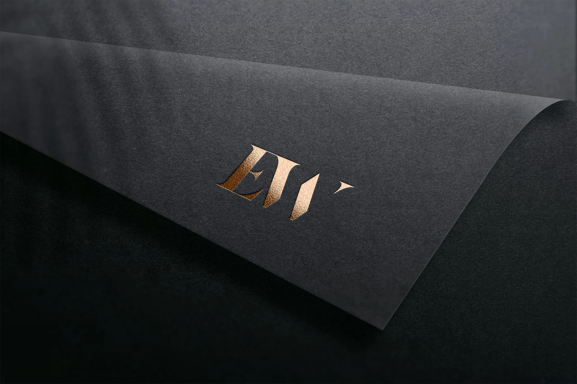

The brand had to do something rare: make constraint feel expensive. Not minimalism for its own sake — precision in service of an audience that notices when something is exactly right.
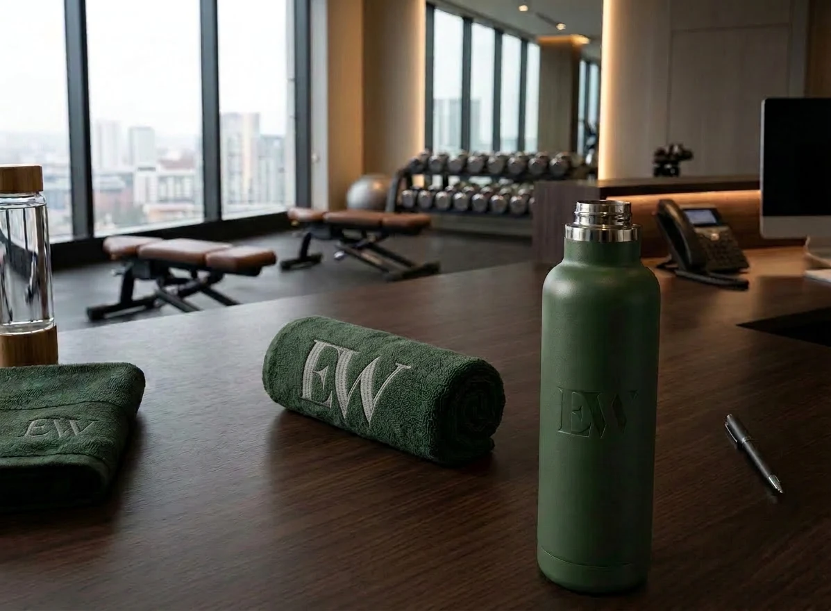
"Working with Geoff on my full branding and website was one of the best decisions I've made for my business. He created an entire branding profile that captured my identity perfectly — from the visual language and tone to the structure and feel of the website. He listened deeply, understood exactly what I wanted, and delivered it on the very first shot. It feels like my real identity finally has a home."Elin Wyn Williams — Founder, Elin Wyn Personal Training